

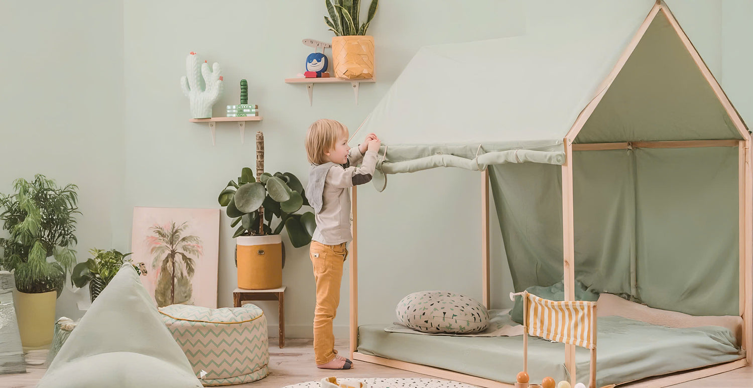
Kids

Settle Bed Canopy, Hanging Linen Canopy

Linen House Tablecloth, Table Cover Playhouse

Linen Play Tent Cover, Kids Teepee Cover

Table Cover Playhouse, Linen House Tablecloth

Linen House Bed Canopy, Linen Canopy Bed

Linen Bed Canopy, Hanging Linen Canopy

Linen Play House Tent, Play House Tent For Kids

Leaf Linen Play Mat, Quilted Baby Play Mat
Clothing

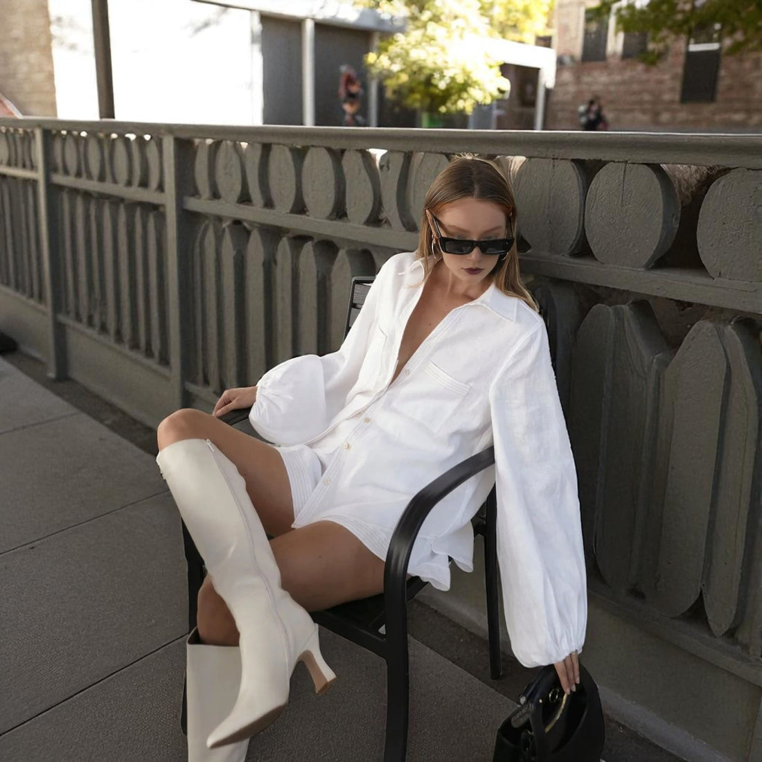
Cropped Linen Shirt, Long Sleeve Cropped Shirt

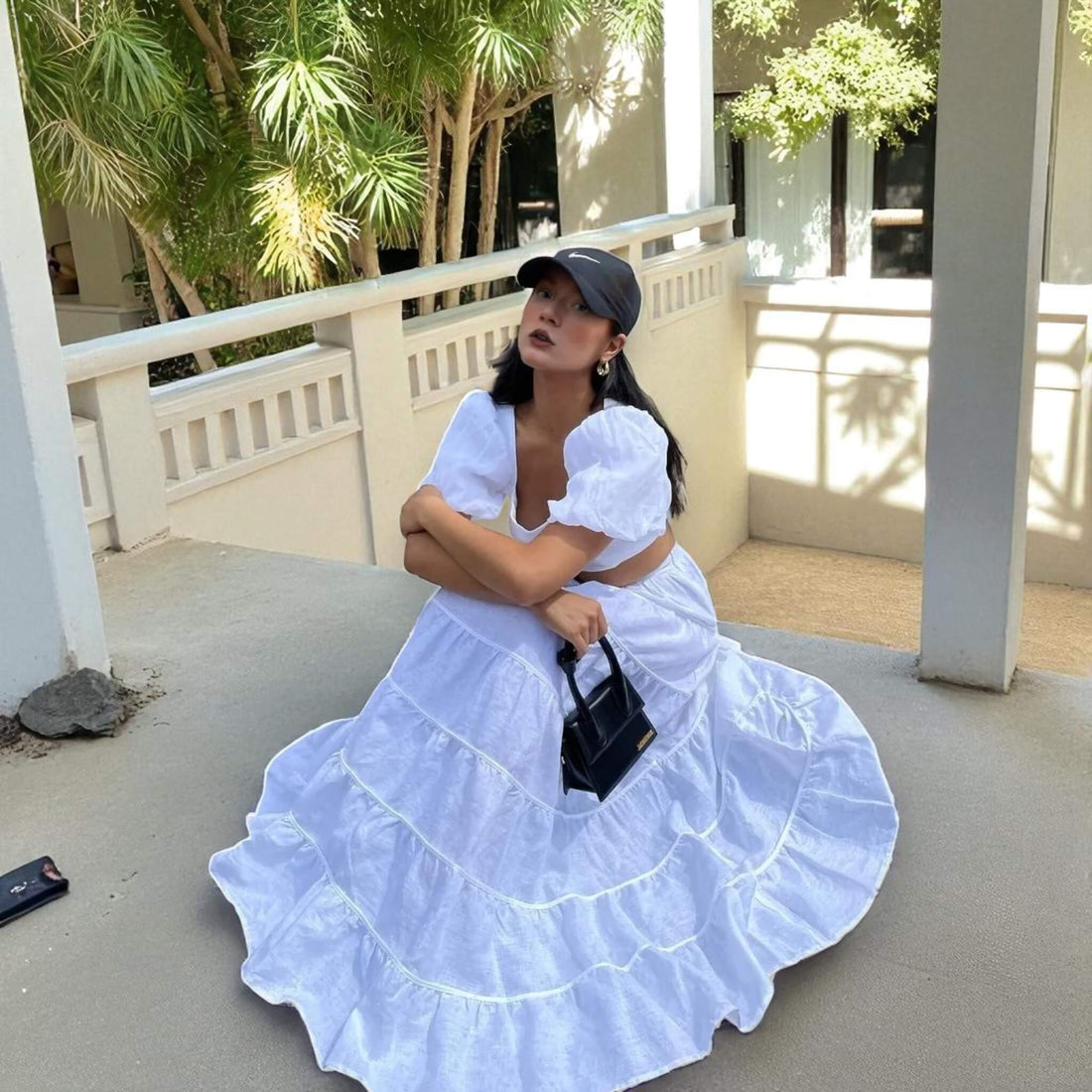
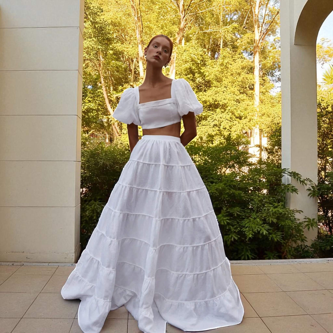
Spaghetti Strap Maxi Dress, Linen V Back Maxi Dress

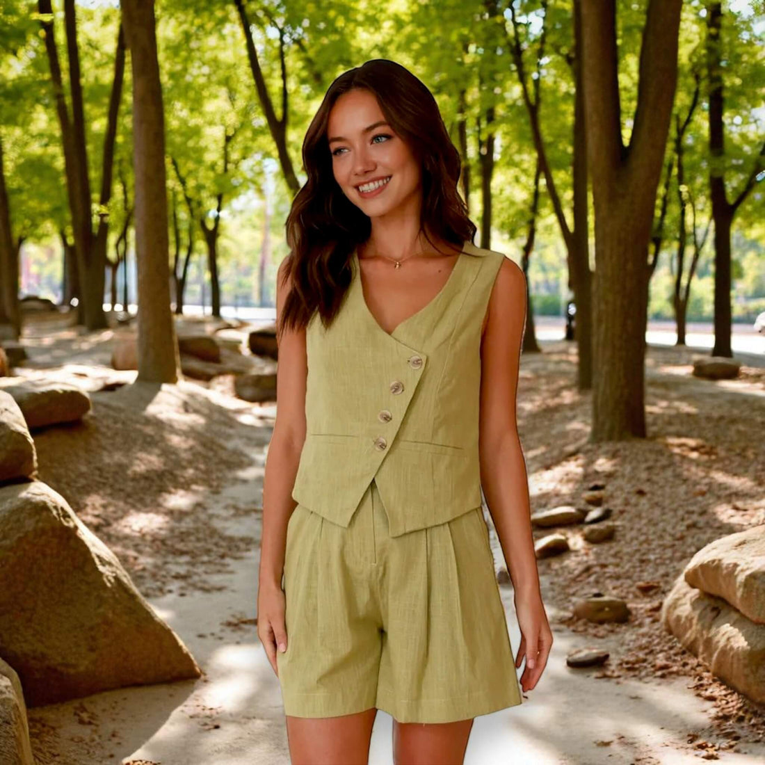
Linen Set Women, Linen Wrap Top And Wide Leg Pants Set

Linen Midi Dress, Square Neck Midi Dress

Linen Drawstring Pants, Cuffed Hem Side Pocket

High Waist Linen Shorts, Scallop Hem

Linen Cropped Flare Pants, High Waist

Linen Button Front Midi Skirt, Front Slit
Bedding

Linen Throw Pillow Cover, Bow Pillow Cover

Linen Pillow Covers, Pillow Case Covers

Linen Christmas Pillow, Decorative Pillows For Christmas

Whale Linen Pillow, Linen Couch Pillows

Embroidered Linen Pillowcase, Linen Pillow Case Covers

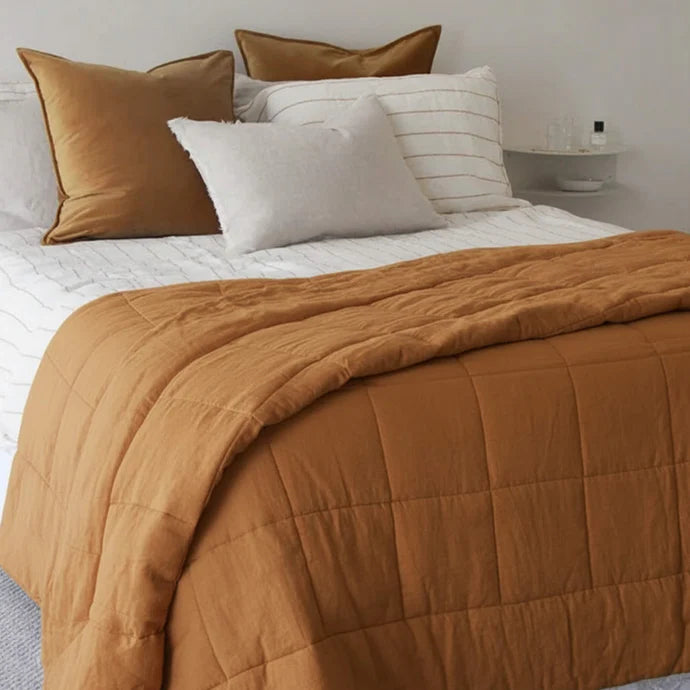
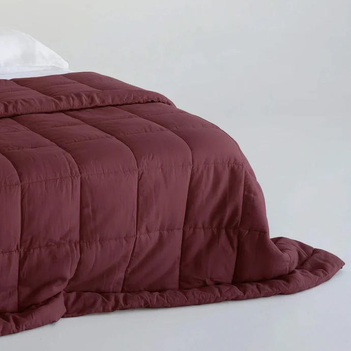
Linen Bed Blanket, Linen Box Quilt

Linen Bed Blanket, Linen Quilted Blanket

Linen Diamond Quilt, Linen Bed Blanket
Home Decor

Ruffle Linen Chair Cover, Dining Chair Linen Cover

Linen Chair Cover, Chair Slipcovers Linen

Round Linen Chair Covers, Linen Chair Slipcover

Pleated Chair Covers, Linen Chair Slipcover

Linen Chair Covers, Linen Dining Chair Covers

Linen Quilted Sofa Overlay, Sofa Seat Cushion

Linen Chair Cushion, Tie On Chair Cushions

Ruffle Linen Napkin, Vintage Linen Napkins
Reviews

Melissa Nane
I’m very happy with this purchase, the quality, the craftsmanship of the vest and the skirt - makes it very very elegant! The skirt has a zipper on the side, very pretty! I asked for pockets and they added it! Order it! send your measurements! It took a few weeks to received it but I loved it ! Thank you - I will buy more soon ❤️

Kimberly Bilbrey
Absolutely stunning dress! Arrived on time for a wedding date (almost a week early!) the color is gorgeous and it fit perfectly! High quality material and it was comfortable all throughout the night! Highly recommend this seller-be sure to take the time to send your measurements-the dress fit like a dream!

Denise De Paoli
The dress I ordered arrived yesterday and it's really well made, the material is good quality. The vendor told me immediately about a slight delay that was happening because of a problem with the original batch of linen. I appreciate the sincerity and that the vendor waited for the supply of better material. Really happy with my purchase. Just needs a bit of ironing and minor tailoring (I ordered it a bit bigger than my size). Used it on my wedding day and it was gorgeous!

Bella Allen
The picture dosent do justice how beautiful the dress. I highly recommend it.😍

Anna
Beautiful dress, fits like a glove. Color is vibrant. Its quite structured which I like. I asked for thinner (2cm) straps and pockets which are perfect. The material is a bit thicker/warmer than I anticipated but it does help it maintain structure. I needed it to arrive in time for a trip and had to pay for rush shipping in the end so I recommend ordering at least 6 weeks before you need it unless you want to pay extra for shipping costs.

Latest posts

How to Style Linen Shorts and Look Polished Anywhere
Linen shorts should feel effortless, yet they often read too relaxed once you step outside. If you’re searching for how to style linen shorts, you ...
Learn more
How To Bleach Linen Without Ruining It
If you’re searching for how to bleach linen but worry about thinning the fabric or making yellowing come back, this guide is for you. Lush Linen Th...
Learn more
How to Get Blood Out of Linen Fast and Safely
Blood on linen feels urgent, but you do not need harsh shortcuts to fix it. In this Lush Linen Threads guide on how to get blood out of linen, you ...
Learn more